Creative Team
D:Jieru
D:Mindi Chen
Client
16开
Creative Summary
The 16Mo logo is created by combining the custom Chinese font "16开", "景德镇". The combination of the brand names "16开" and "景德镇" in the logo design aims to express the brand's growth in Jingdezhen, a place symbolizing exceptional ceramic craftsmanship and national pride.
The choice of the name "16开" is inspired by the brand founder's passion for painting, who has been using size 16Mo paper for sketching since childhood. Therefore, a 16Mo proportioned graphic is used as an auxiliary element to visualize the boundless imagination for ceramic objects.
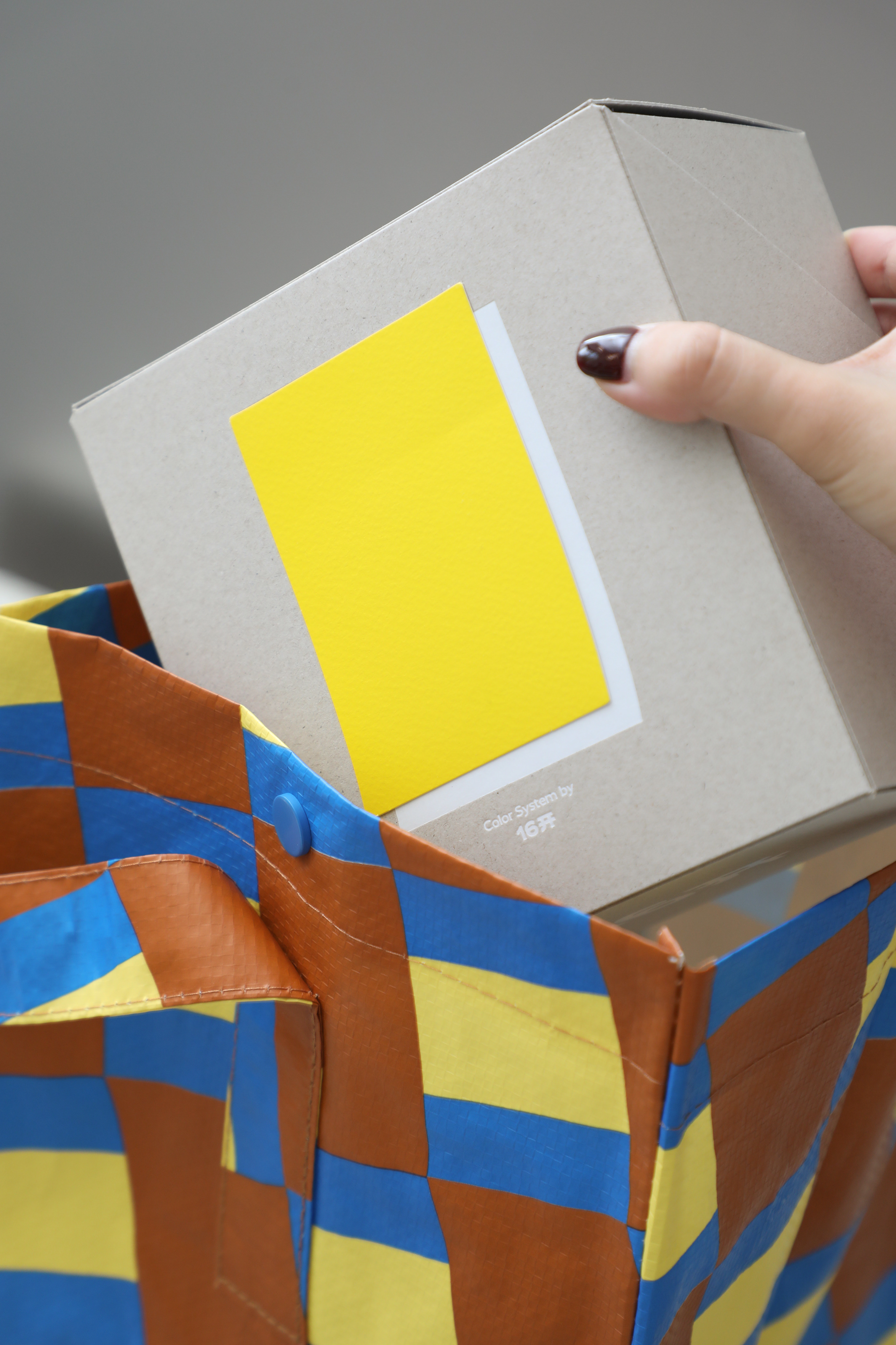
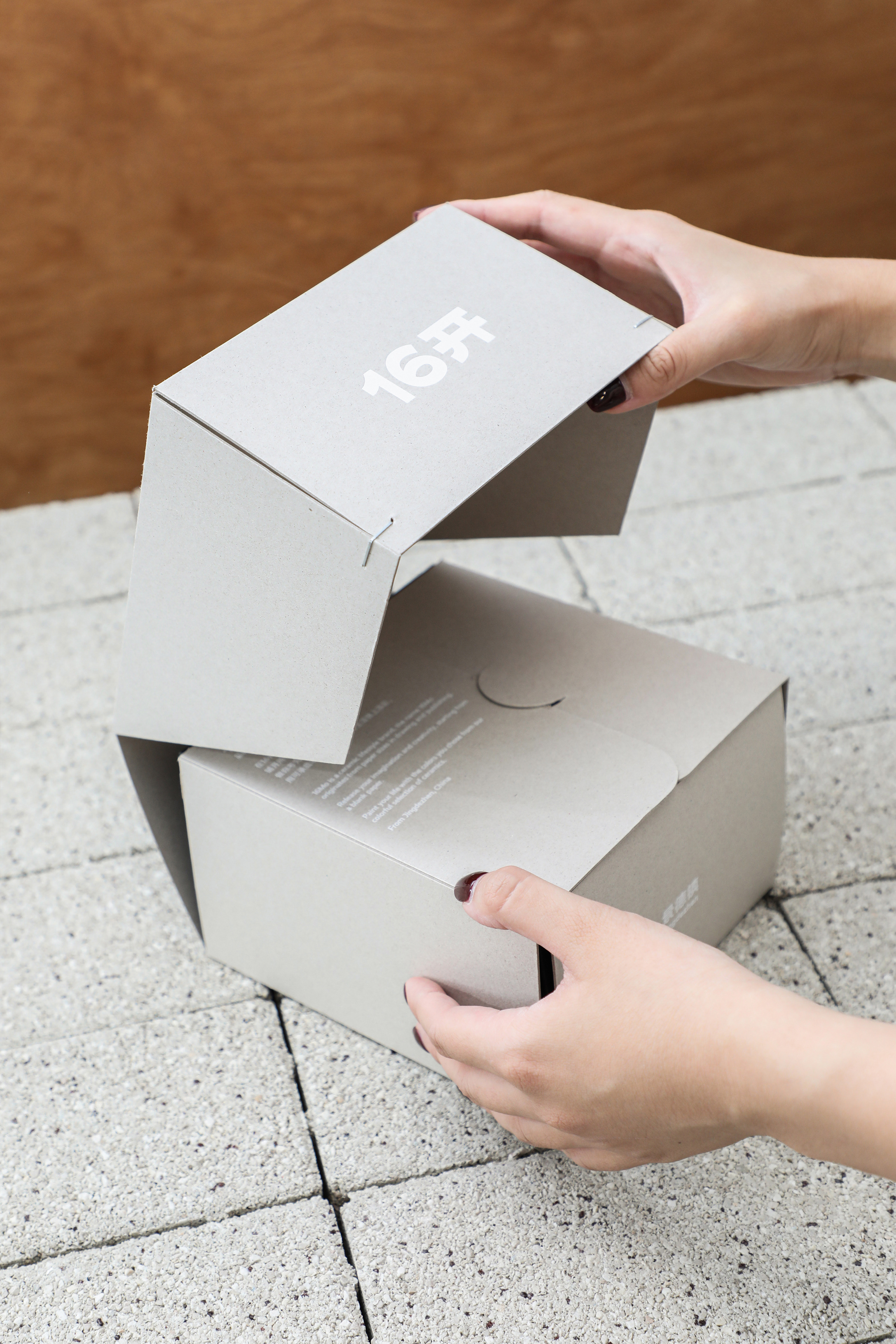
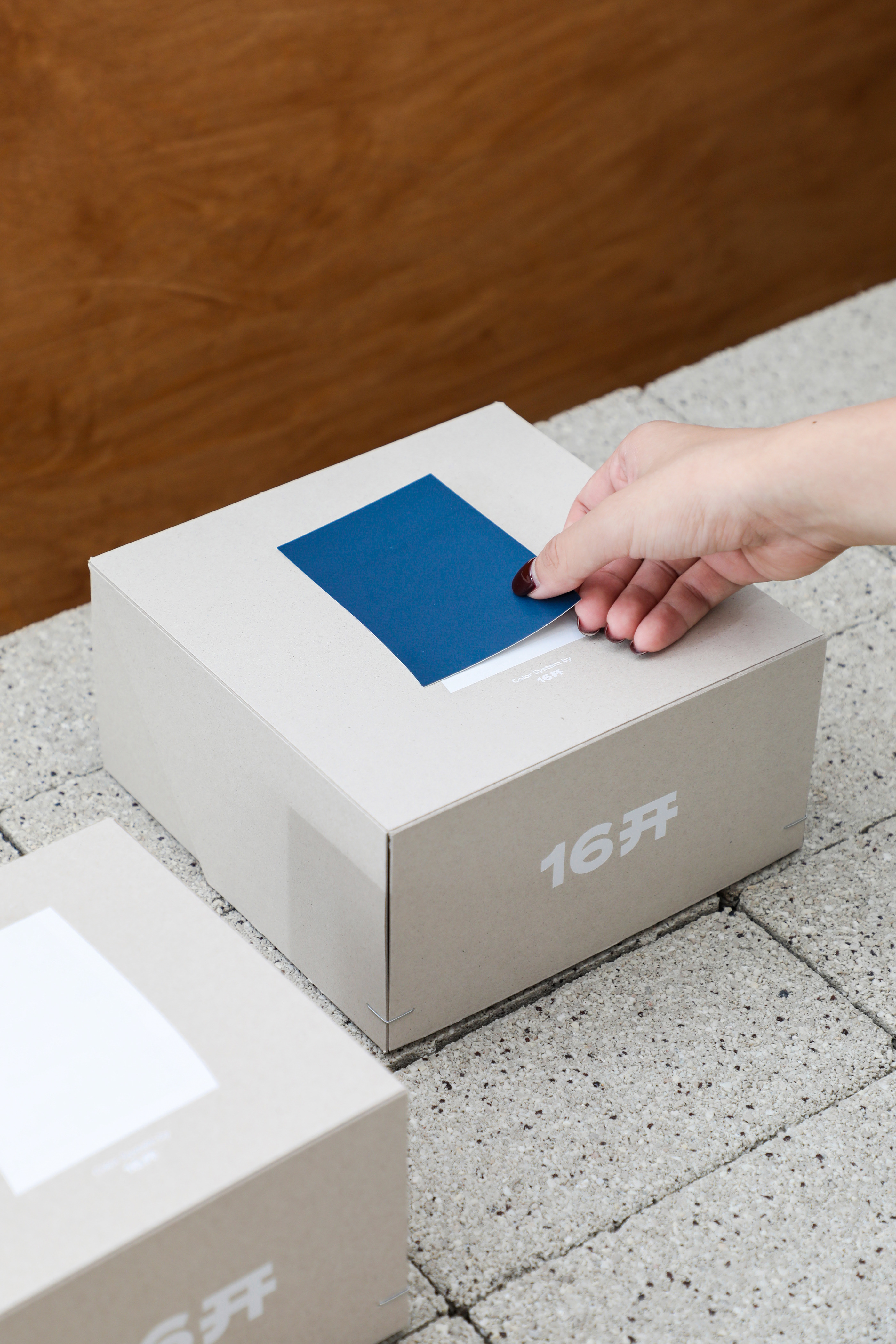
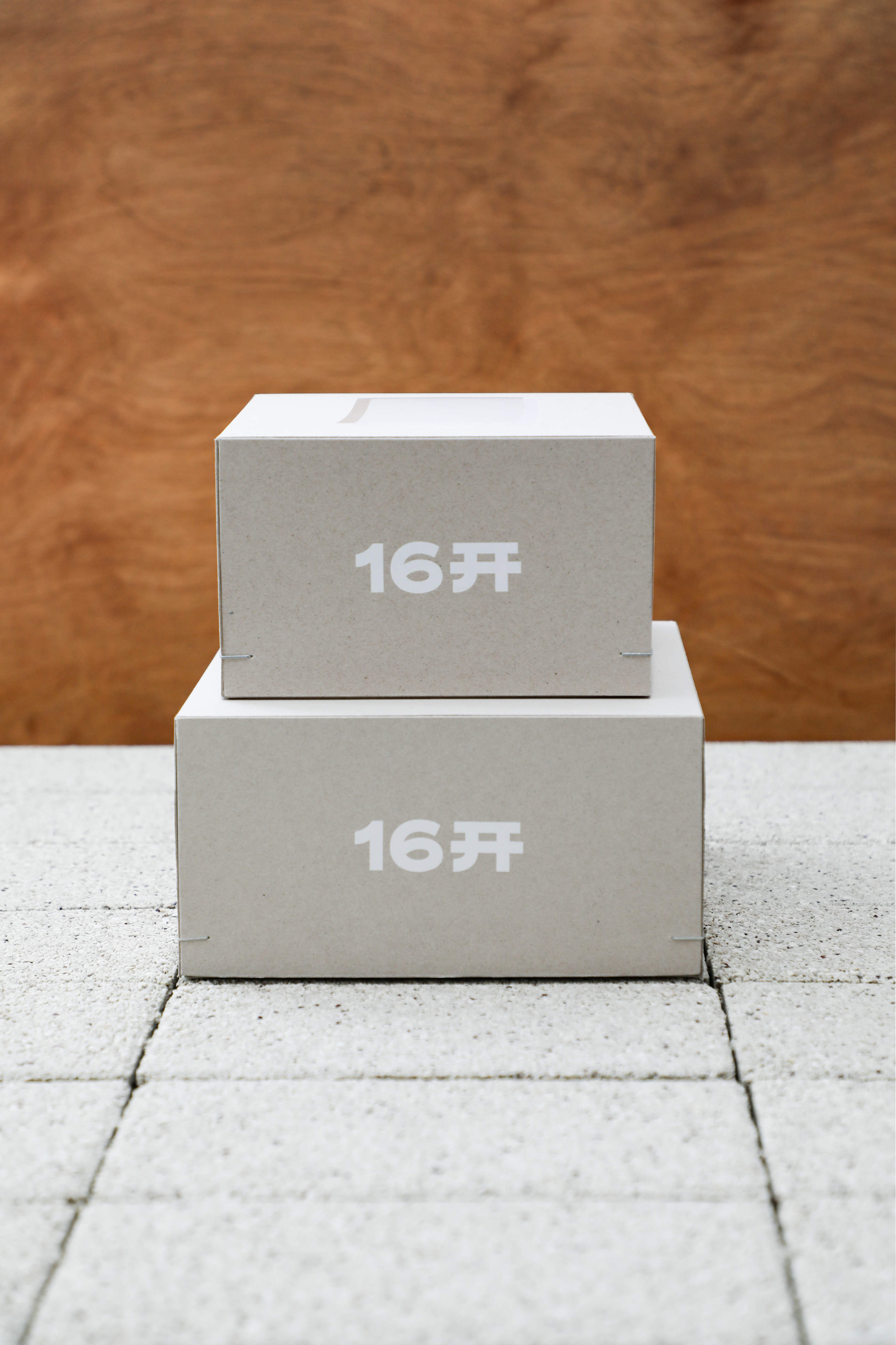
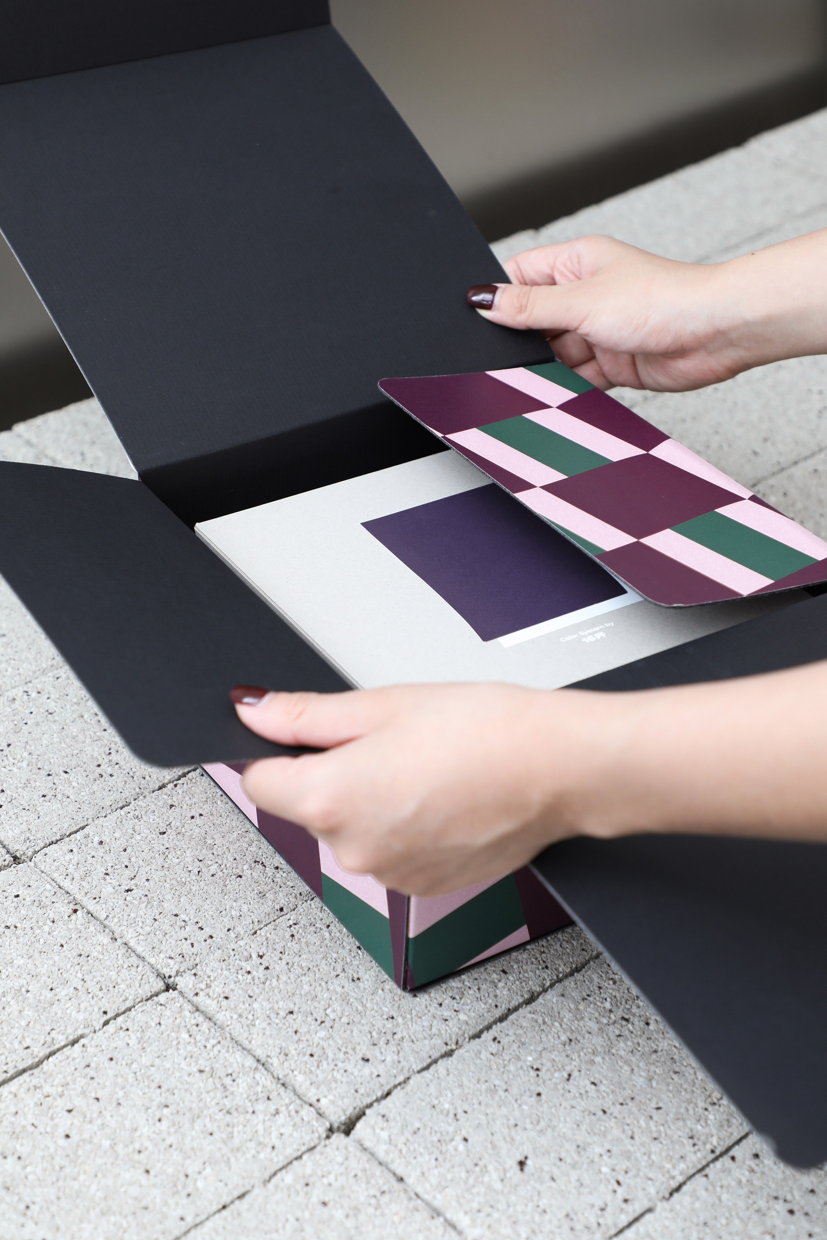
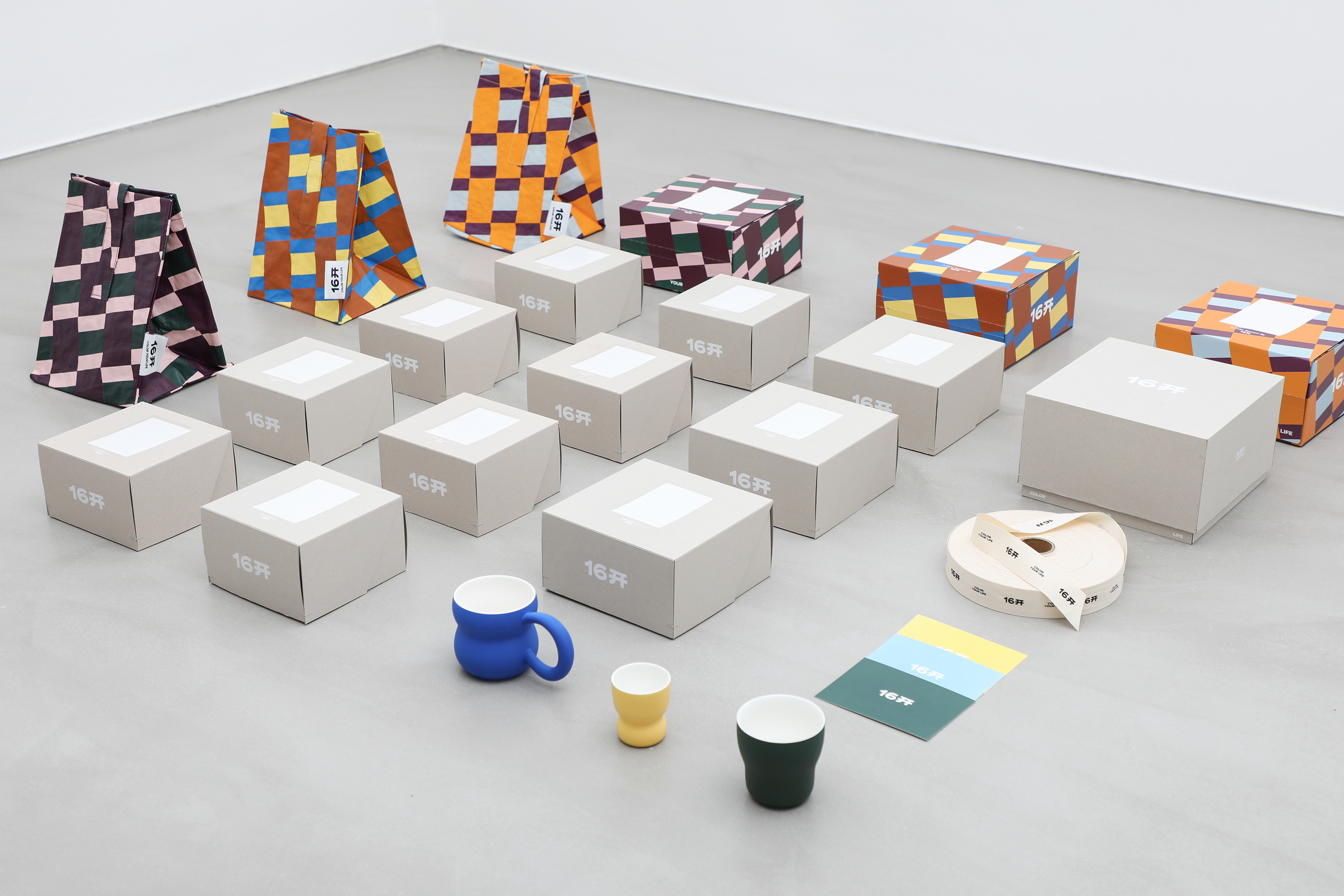
In terms of packaging, 16Mo advocates for environmental sustainability and completely avoids the use of plastic packaging. Instead, the entire packaging system is made from eco-friendly recycled paper. The unique box structure enhances the sense of ceremony when consumers open the packaging.
The colorful and diverse cups are the soul of 16Mo's products. Therefore, on the outer packaging, color card papers representing each cup are designed, with 16Mo providing their interpretation of the colors on the back of the color cards.