Creative Team
CD: Liao Zicheng
D:Liao Zicheng, Yang Haosong
Client
Ting Group
Creative Summary
TORISAWĀ, is a new catering brand known for creating tasty Japanese yakitori bistros. It leads the Japanese yakitori bistros in Shanghai. There are two Japanese words ‘TORI’ and ‘SAWĀ’ in the brand that is synonymous with their two core products: yakitori and sake, respectively.
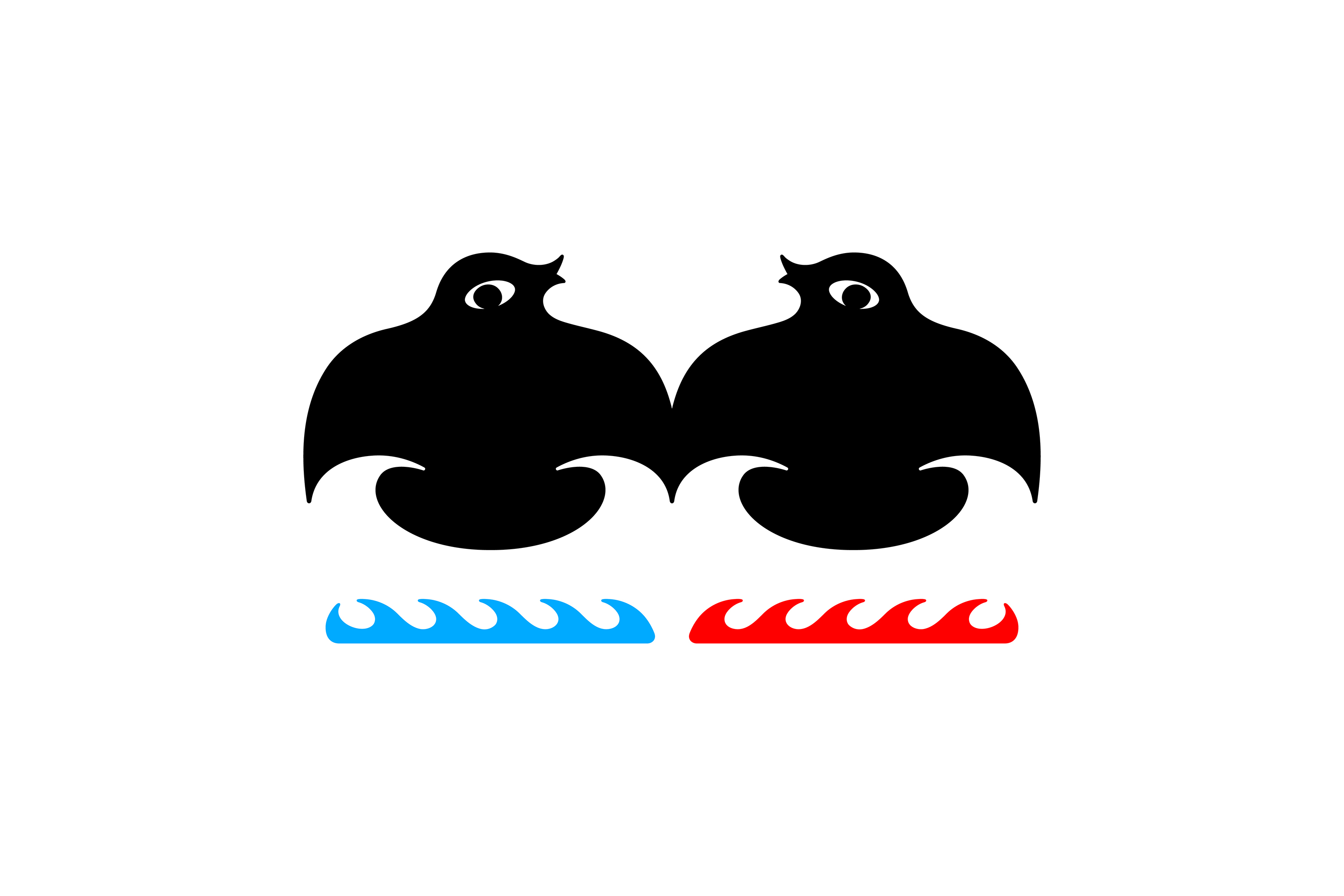
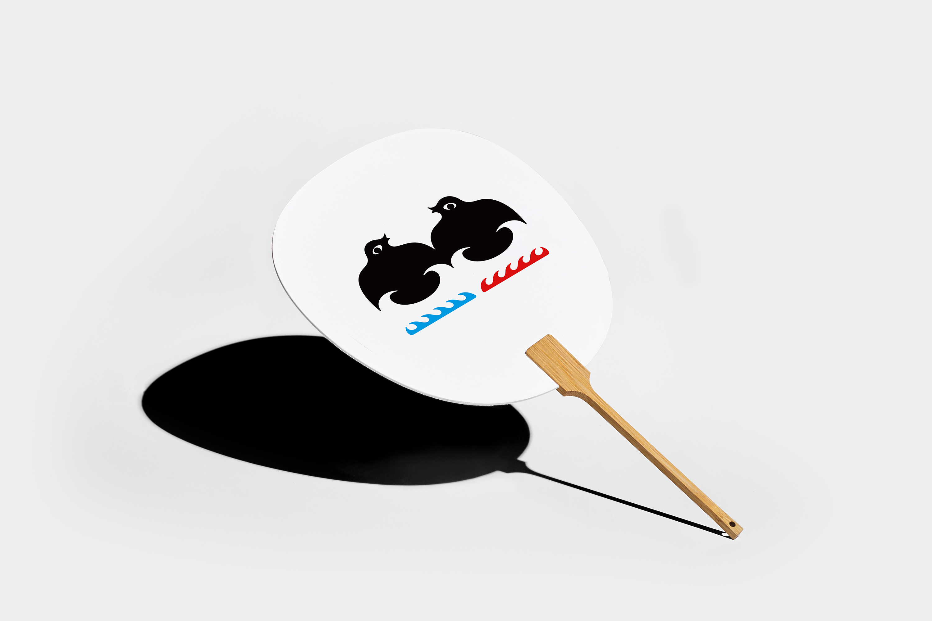
For the second anniversary, we use the concept of ‘half sea, half fire’ to design and plan the overall visual identity for the TORISAWĀ campaign. The graphic identity features a dynamic and evocative ‘Chidori’, signifying the spirit of TORISAWĀ as a new brand that respects tradition but seeks to innovate and constantly try to improve itself.
The red ‘nami’ beneath the ‘chidori’ means Flame, the searing heat of a burning bird, while the blue ‘nami’ symbolises Ocean. The blue ‘nami’ symbolises Ocean, underlining TORISAWĀ's focus on matching wine with food and the strictest standards of Japanese bartending. The balance and interplay of fire and water is a perfect match for the brand's name and concept.