Creative Team
D:Xu Ye / Yan Xiaoyue
SC:Fuzhou University
Creative Summary
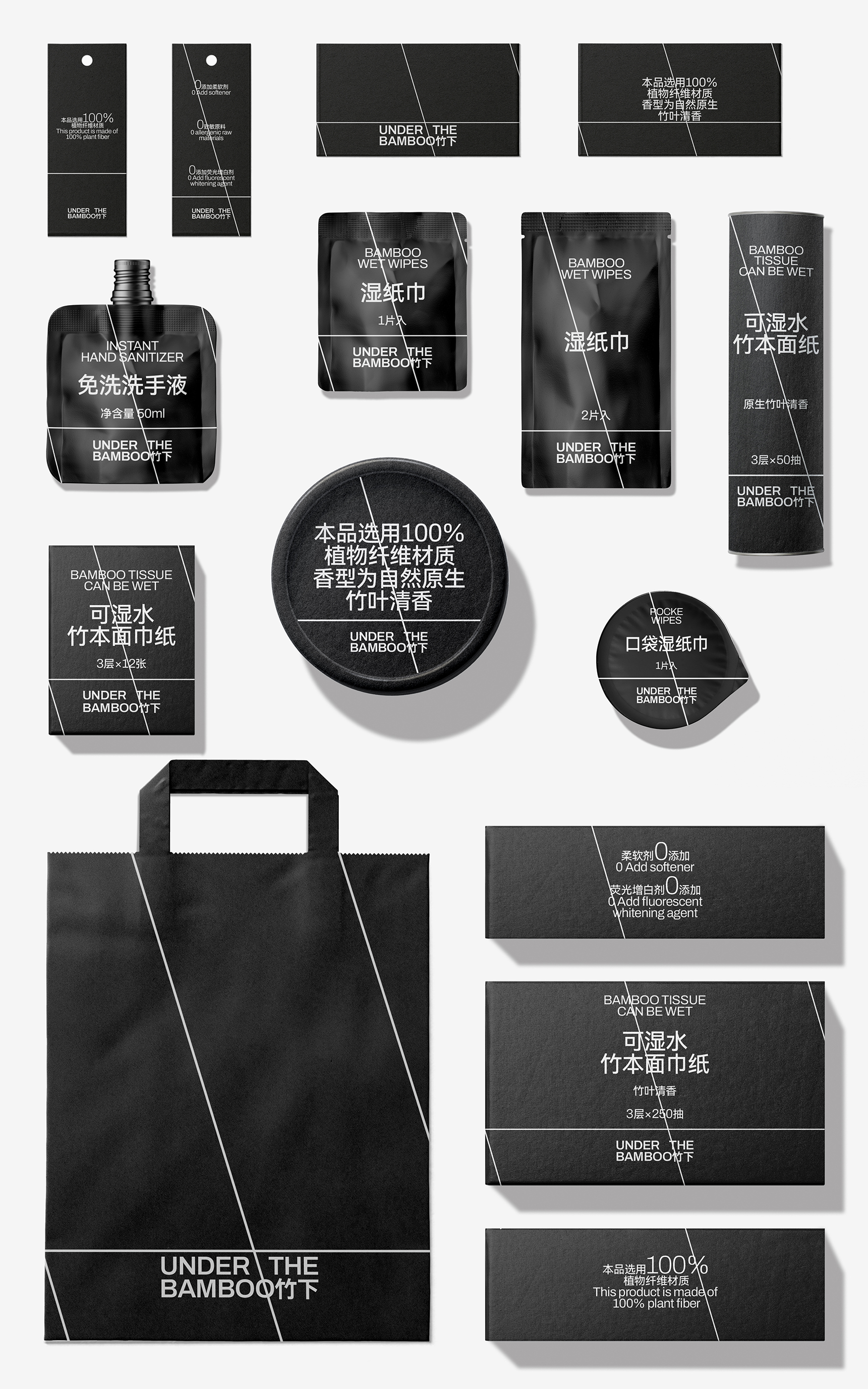
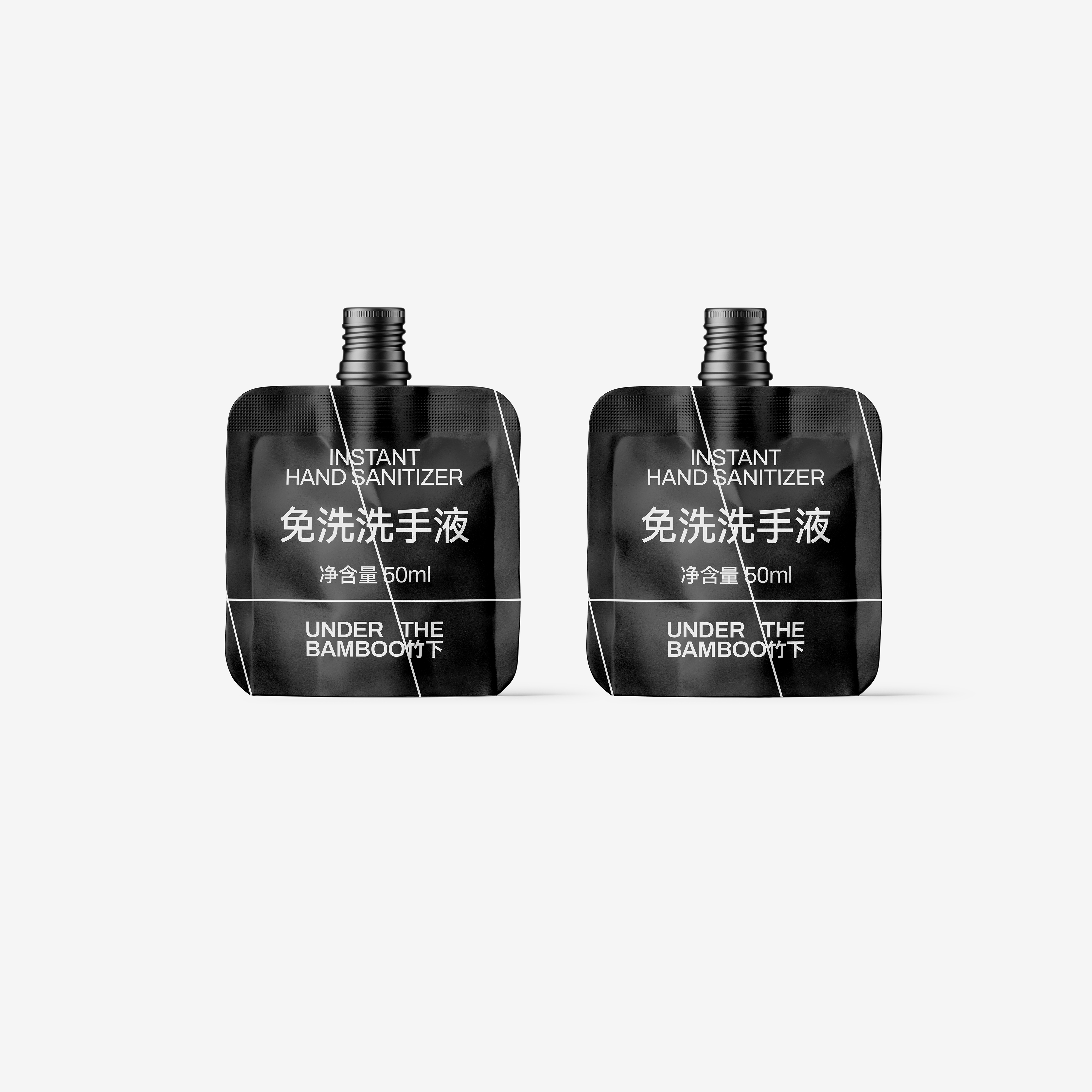
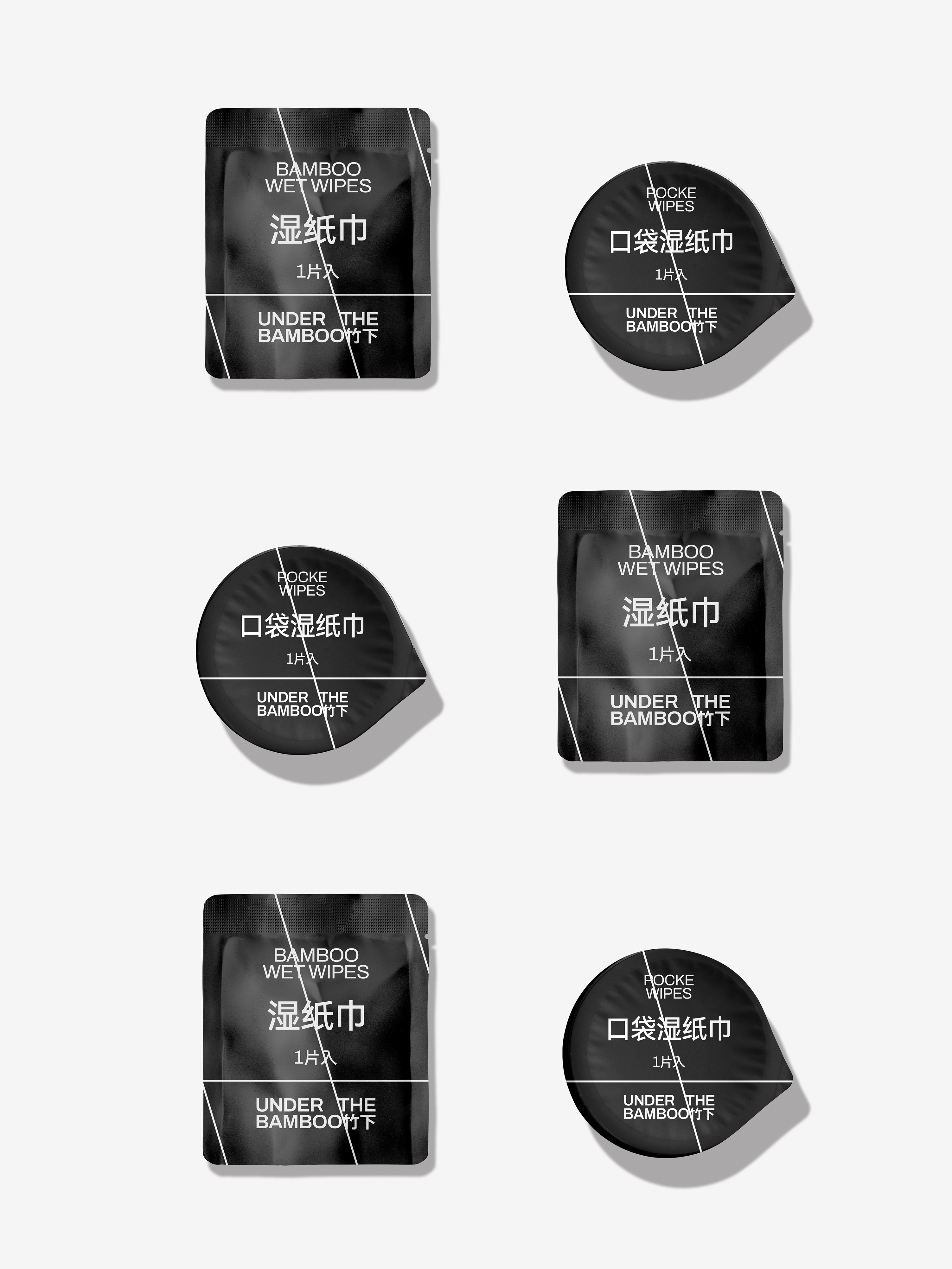
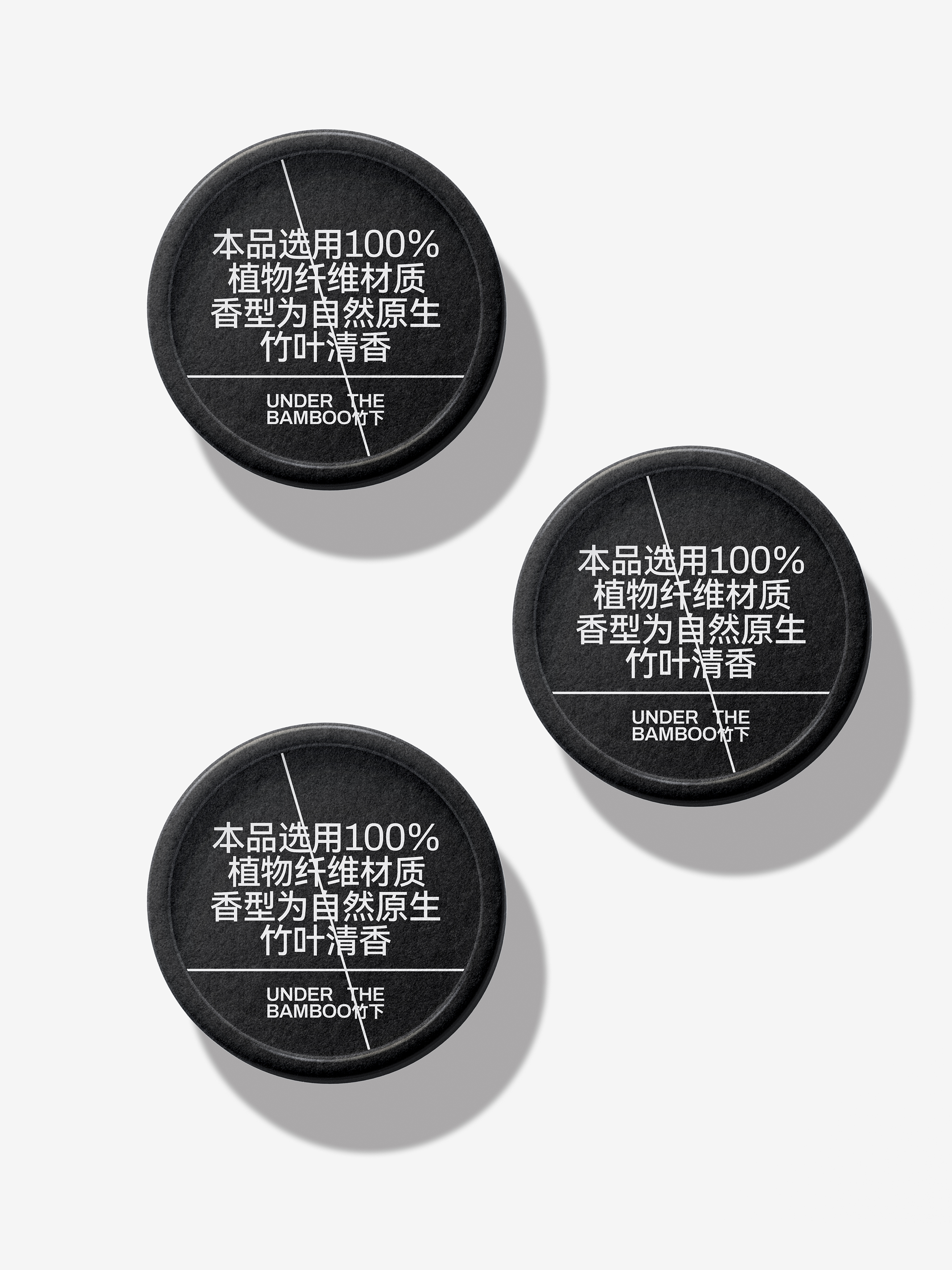
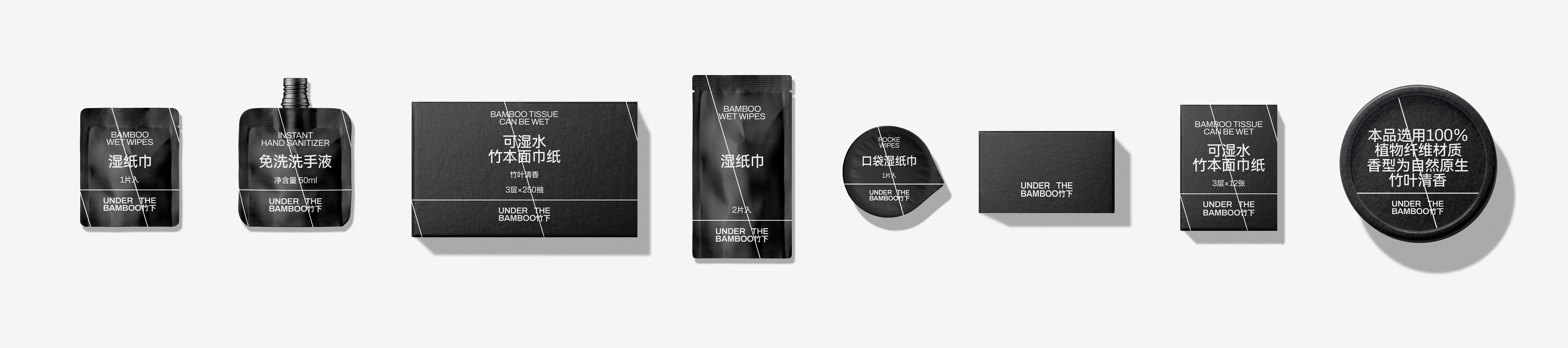
‘UNDER THE BAMBOO’is a main bamboo paper brand, bamboo with strong renewable and natural bacteria, with fresh characteristics. ‘UNDER THE BAMBOO’ wants to convey to consumers, not only the quality of environmental protection and fresh, but also a clean and rational lifestyle.
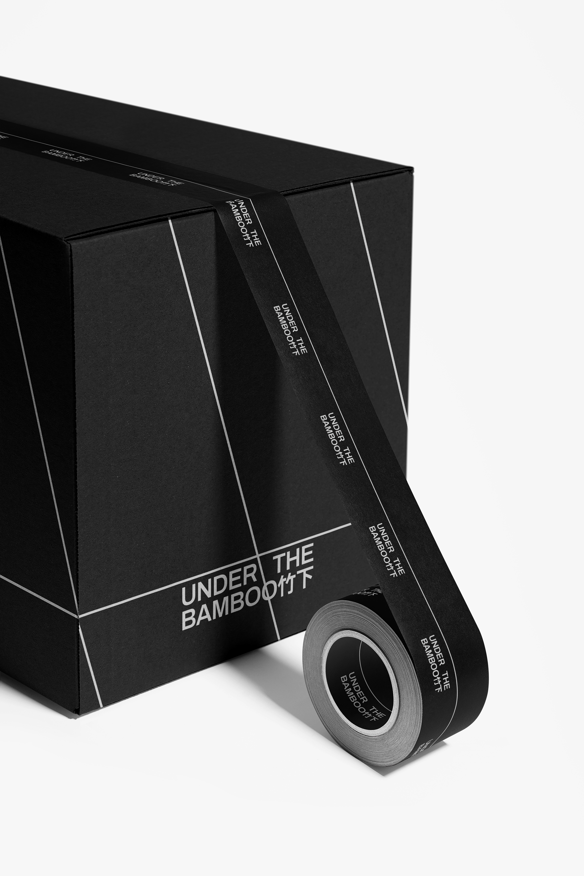
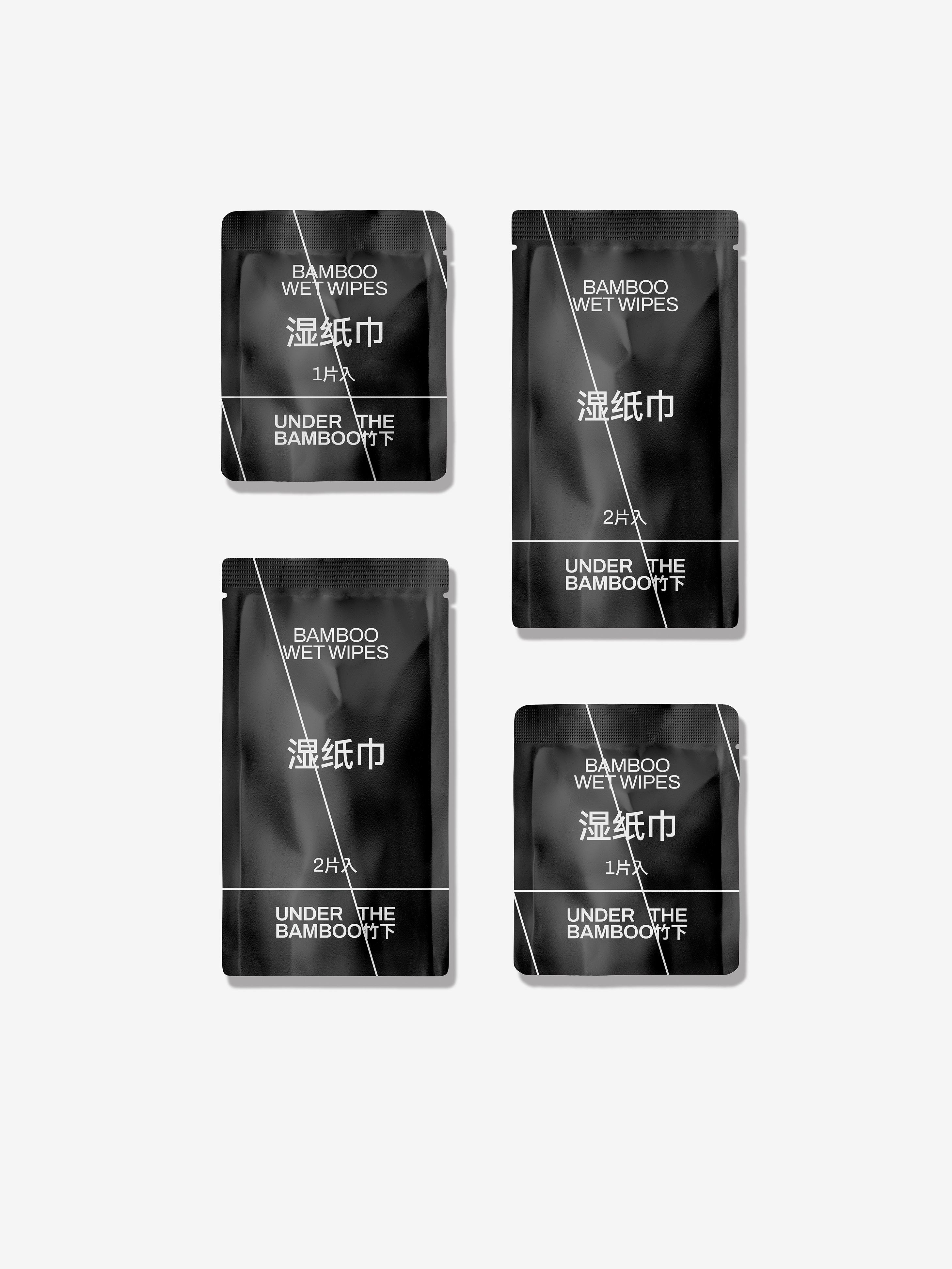
This makes simplicity the preferred design language for our brand design this time. In addition to the simple and clean typesetting choice, we chose black and white as the brand colors to create a clear contrast to achieve visual effects. Put the information elements in the first place, plan the information in proportion to the level, and highlight the main information. With rigorous information layout design, to reflect the enterprise's own enterprise convincing force.
The Chinese and English typesetting of the brand is based on natural harmony considerations, simplifying the design and emphasizing the brand name and category description, highlighting the important information content. In typographic design, We seize the characteristics of the product itself, the numbers and selling points refined to do amplification processing, more intuitive and concise reflection of product competitiveness.
By extracting the shape of bamboo, cutting and adjusting the lines combined with the characteristics of bamboo, using geometric methods to express, discarding excessive graphic decoration, in order to achieve an eye-catching design effect.
In addition to the simple and clean typesetting choice, we chose black and white as the brand colors to create a clear contrast to achieve visual effects.